May 6th, 2013
There is so much to be said about leaving some of your letterpress design inkless. The inkless or blind impression gives such a balance to the artwork. It especially looks fabulous when being used with a thick font type or as a border.
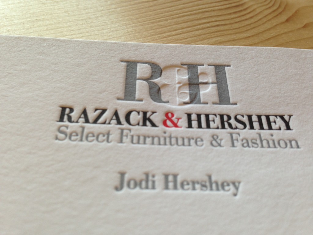
Here you see we just used it with one letter in the logo.

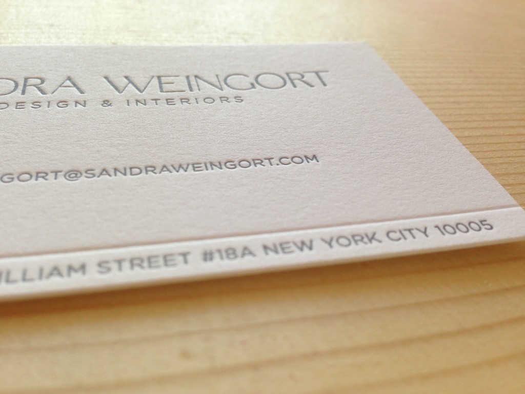
On this card we just did a blind line to subtly separate the artwork without using a harsh colored stroke.


